“How Many People Have Been Killed by Guns Since Newtown?” Interactive map created by Slate and @GunDeaths visualizing the toll firearms have taken since Dec. 14.
In Un-Selling The Gun a couple of weeks ago I touched upon the problem of conveying the impact of firearms on the individuals and communities they effect. Humans aren’t always very good at understanding data. In fact, some studies have shown that comprehending specific amounts above the number 3 is still a relatively new skill. And that’s where charts, maps, visualizations, and narratives come in handy. People will go to some interesting lengths to compensate for the limitations of the human brain.
In addition to emotional, first-person stories, gun policy activist Arkadi Gerney once used a “murder truck” (his nickname) to display the number of Americans murdered with guns since the Gabby Giffords shooting. In his piece on The New Yorker‘s website, he wrote:
On the morning of February 16, 2011, when Mayor Bloomberg launched the truck on a national tour, the digital display read “1,311.” Omar Samaha , whose sister was murdered at Virginia Tech, would captain what was officially called the “Fix Gun Checks” truck on a journey across America.

Image of the “Fix Gun Checks” truck via HuffPo
But the truck and Gerney’s best efforts still didn’t result in the gun control legislation that he’d hoped to pass. Maybe the bare number by itself (well, with a spokesman and his heart-wrenching story) wasn’t enough to get the message across.
Slate has a similar yet perhaps more powerful project called “How Many People Have Been Killed by Guns Since Newtown? in which every individual killed is represented by an icon showing whether they were an adult or child, female or male. The graphic is also sortable by age, gender, and date and is accompanied by a the same data applied to a map of the U.S. and filterable by location (screenshot at top). There’s something about the human shapes that really stuns. Maybe it’s a sense of scale? I can mentally place these people in relationship to my own body, to the scale of an individual person. And then pull out to a macro view of the country or city. This micro/macro pairing just works for me. It’s graphic without being gratuitous. Simple and but not sanitized.

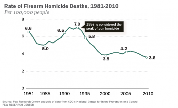
Speaking of data, there was quite a kerfuffle a few weeks back over the release of a Pew Research report demonstrating that the number of gun deaths has been going down since a peak in the mid 90’s. According to Pew:
Despite national attention to the issue of firearm violence, most Americans are unaware that gun crime is lower today than it was two decades ago. According to a new Pew Research Center survey, today 56% of Americans believe gun crime is higher than 20 years ago and only 12% think it is lower.
Maybe we’re just better at understanding the gravity of these numbers? Perhaps it isn’t that we think crime is statistically increasing. Rather, increased access to information, personal stories, and illustrative data design lets us understand just how bad gun violence is. Perhaps our awareness of firearms-related deaths is increasing even as the actual number has been decreasing?